get_era5_country_temperature() resolves a country
boundary, downloads monthly ERA5 data, and returns cosine-latitude
area-weighted national averages. We get all of that from one call,
instead of finding boundaries, writing GeoJSON, calling
era5ify_geojson(), and aggregating grid cells by hand.
Here we pull monthly mean, max, and min temperatures for four European and four South Asian countries in 2024.
Download data
We pass the variables shorthands "mean",
"max", and "min".
countries <- c(
  "France", "Germany", "Spain", "Norway",
  "India", "Pakistan", "Bangladesh", "Nepal"
)

all_data <- lapply(countries, function(cntry) {
  df <- get_era5_country_temperature(
    country    = cntry,
    start_date = "2024-01-01",
    end_date   = "2024-12-31",
    variables  = c("mean", "max", "min")
  )
  df$country <- cntry
  df
})

temps <- bind_rows(all_data)
head(temps)
#   year month temperature_max temperature_mean temperature_min country
# 1 2024     1        6.852207         6.953495        6.225498  France
# 2 2024     2       10.040868        10.223489        9.456424  France
# 3 2024     3       11.683986        12.049970       11.041785  France
# 4 2024     4       13.844017        14.307139       13.269198  France
# 5 2024     5       16.621092        17.035453       16.117049  France
# 6 2024     6       20.049674        20.751232       19.515942  France
We tag each country with its region for faceting.
region_map <- c(
  France = "Europe", Germany = "Europe", Spain = "Europe", Norway = "Europe",
  India = "South Asia", Pakistan = "South Asia",
  Bangladesh = "South Asia", Nepal = "South Asia"
)

temps$region <- region_map[temps$country]
temps$month_label <- factor(month.abb[temps$month], levels = month.abb)

# Cool tones for Europe, warm tones for South Asia
country_colors <- c(
  France = "#2166AC", Germany = "#4393C3",
  Spain = "#92C5DE", Norway = "#053061",
  India = "#B2182B", Pakistan = "#D6604D",
  Bangladesh = "#F4A582", Nepal = "#67001F"
)
Seasonal heatmap
ggplot(temps, aes(x = month_label, y = country, fill = temperature_mean)) +
  geom_tile(color = "white", linewidth = 0.4) +
  facet_grid(region ~ ., scales = "free_y", space = "free_y") +
  scale_fill_distiller(
    palette = "RdYlBu", direction = -1,
    name = "Mean temp (\u00B0C)"
  ) +
  labs(
    x = NULL, y = NULL,
    title = "Mean monthly temperature by country (2024)"
  ) +
  theme_minimal(base_size = 12) +
  theme(
    panel.grid = element_blank(),
    strip.text.y = element_text(angle = 0, face = "bold")
  )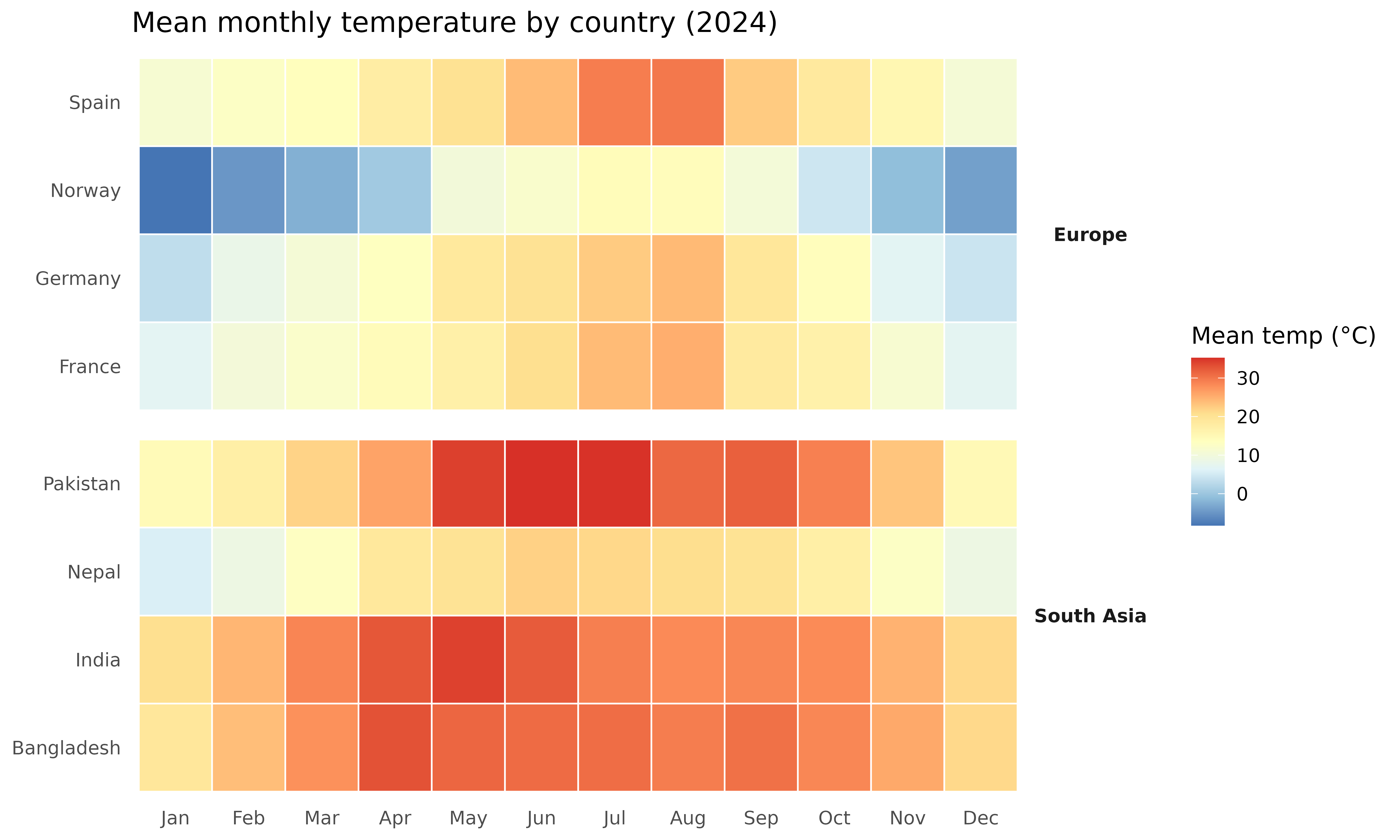
South Asian countries stay above 20 °C year-round. European countries swing 20+ °C between winter and summer, with Norway dropping below freezing from November through March.
Monthly trend lines with min/max ribbon
ggplot(temps, aes(x = month, color = country, fill = country)) +
  geom_ribbon(aes(ymin = temperature_min, ymax = temperature_max),
    alpha = 0.15, color = NA
  ) +
  geom_line(aes(y = temperature_mean), linewidth = 0.9) +
  geom_point(aes(y = temperature_mean), size = 1.5) +
  facet_wrap(~region, ncol = 1, scales = "free_y") +
  scale_color_manual(values = country_colors) +
  scale_fill_manual(values = country_colors) +
  scale_x_continuous(breaks = 1:12, labels = month.abb) +
  labs(
    x = NULL, y = "Temperature (\u00B0C)",
    title = "Monthly temperature with min-max range (2024)",
    subtitle = "Ribbon: national-average daily min to daily max",
    color = NULL, fill = NULL
  ) +
  theme_minimal(base_size = 12) +
  theme(legend.position = "bottom")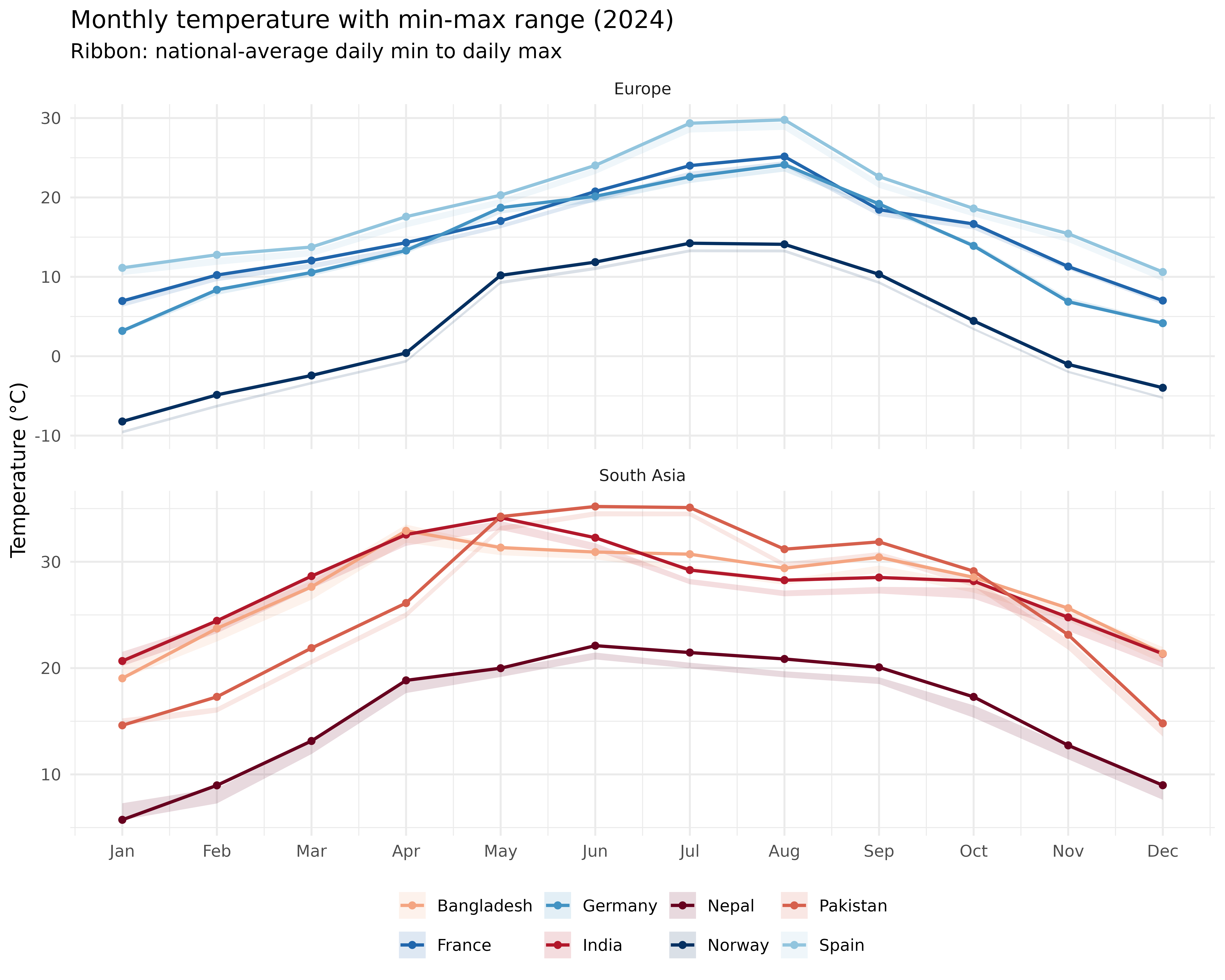
Diurnal range
The gap between daily max and min (DTR) is wider in continental and arid climates than in humid tropical ones.
temps$dtr <- temps$temperature_max - temps$temperature_min

ggplot(temps, aes(x = month, y = dtr, color = country)) +
  geom_line(linewidth = 0.9) +
  geom_point(size = 1.5) +
  facet_wrap(~region, ncol = 1) +
  scale_color_manual(values = country_colors) +
  scale_x_continuous(breaks = 1:12, labels = month.abb) +
  labs(
    x = NULL, y = "Diurnal temperature range (\u00B0C)",
    title = "Monthly diurnal temperature range (2024)",
    color = NULL
  ) +
  theme_minimal(base_size = 12) +
  theme(legend.position = "bottom")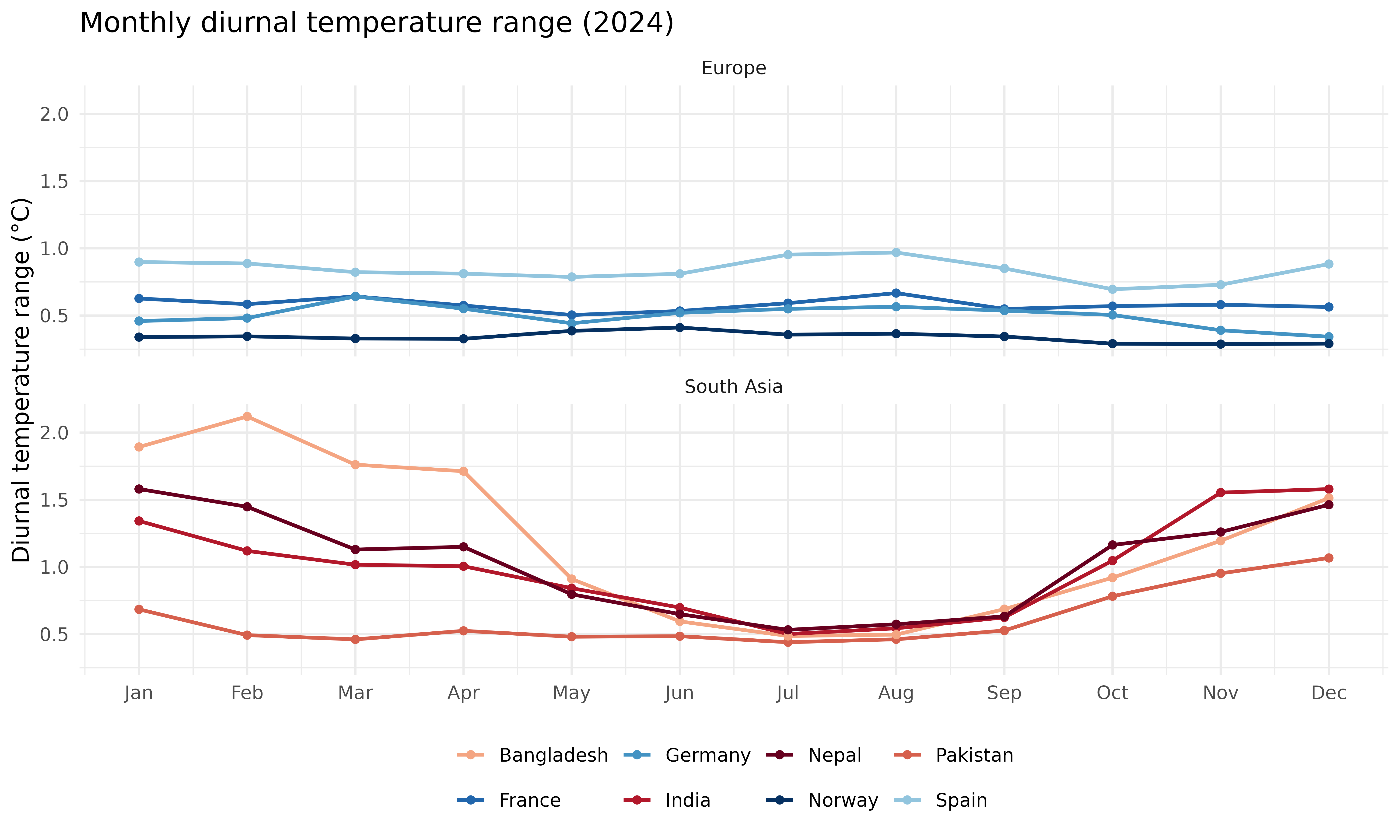
Regional comparison
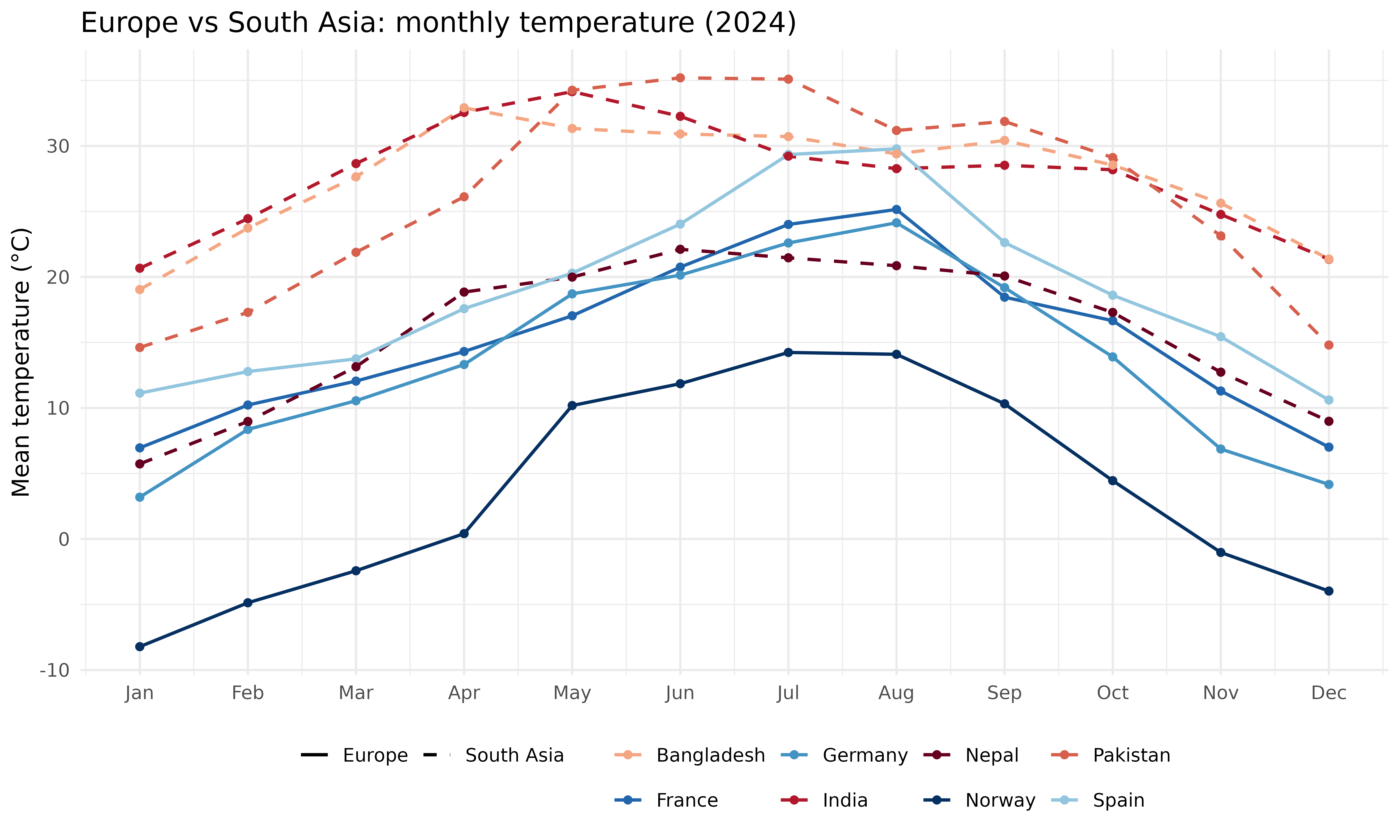
Finally, we put all eight countries on a single axis, with line type separating the two regions.
ggplot(temps, aes(
  x = month, y = temperature_mean,
  color = country, linetype = region
)) +
  geom_line(linewidth = 0.8) +
  geom_point(size = 1.5) +
  scale_x_continuous(breaks = 1:12, labels = month.abb) +
  scale_color_manual(values = country_colors) +
  scale_linetype_manual(values = c("Europe" = "solid", "South Asia" = "dashed")) +
  labs(
    x = NULL, y = "Mean temperature (\u00B0C)",
    title = "Europe vs South Asia: monthly temperature (2024)",
    color = NULL, linetype = NULL
  ) +
  theme_minimal(base_size = 12) +
  theme(legend.position = "bottom")