library(indiacensus)
library(dplyr)
library(ggplot2)
library(ggrepel)
library(biscale)
library(patchwork)
Scheduled Castes (SC) and Scheduled Tribes (ST) are constitutionally recognized groups in India. Their geographic distribution reflects historical settlement patterns and regional diversity.
sc_st_2011 <- census_2011_pca |>
  mutate(
    sc_pct = 100 * sc_population / population_total,
    st_pct = 100 * st_population / population_total
  ) |>
  attach_geometry(year = 2011, geography = "district")

sc_st_1971 <- census_1971 |>
  filter(geography == "district") |>
  mutate(
    sc_pct = 100 * sc_population_total / population_total,
    st_pct = 100 * st_population_total / population_total
  ) |>
  attach_geometry(year = 1971, geography = "district")
Scheduled Caste population
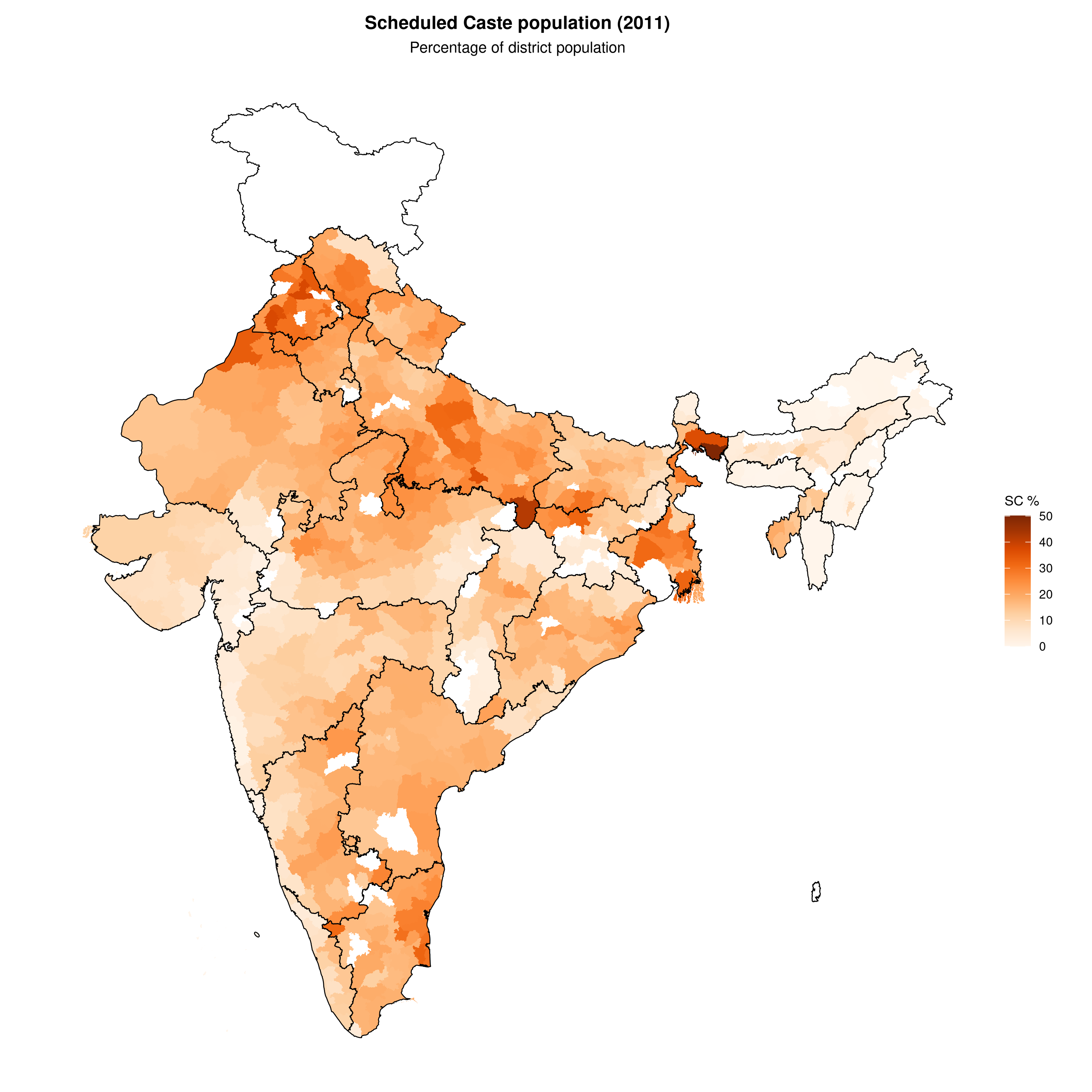
SC: 2011
plot_map(
  sc_st_2011,
  fill_var = "sc_pct",
  title = "Scheduled Caste population (2011)",
  subtitle = "Percentage of district population",
  legend_title = "SC %",
  palette = "oranges",
  show_state_boundaries = TRUE
)
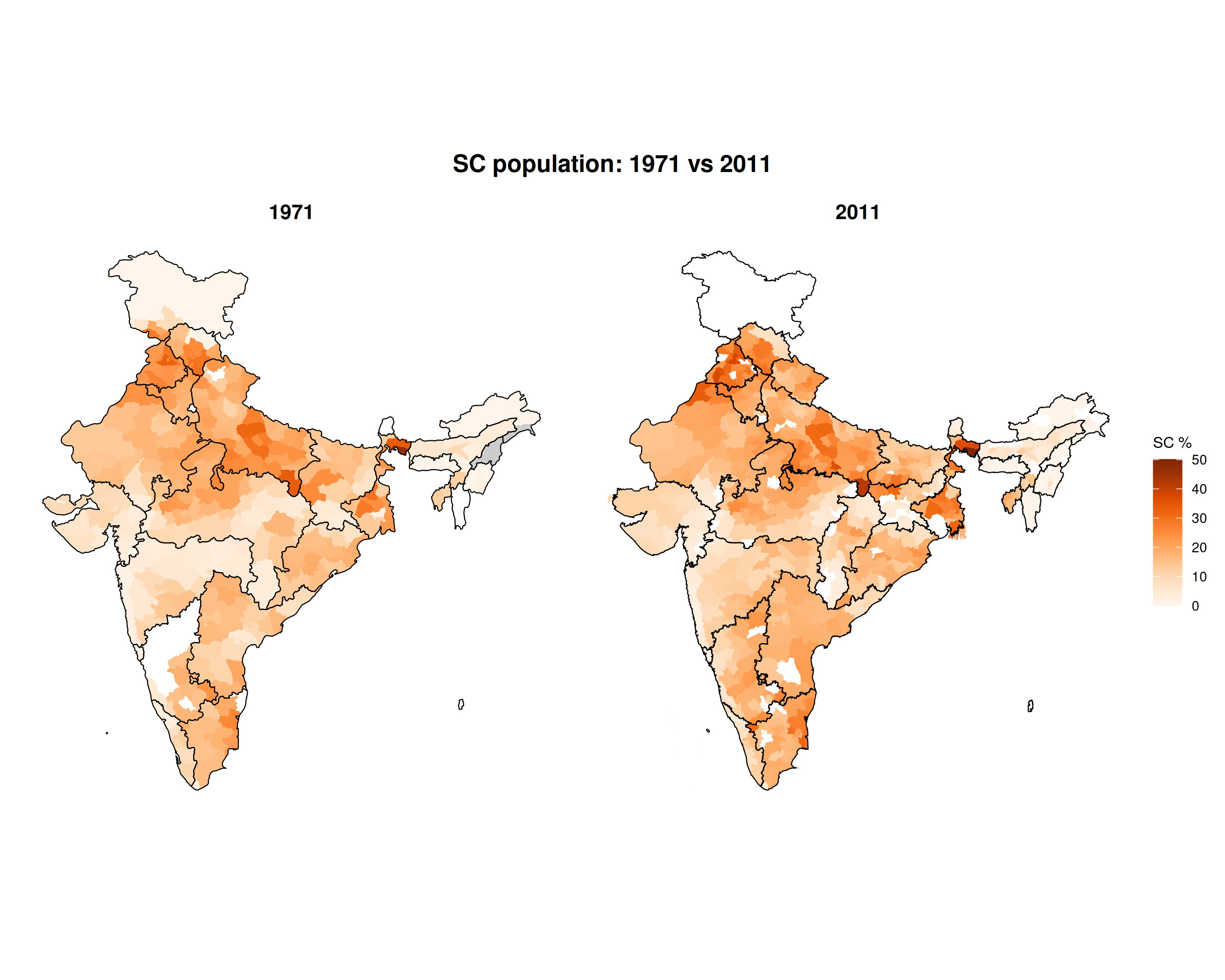
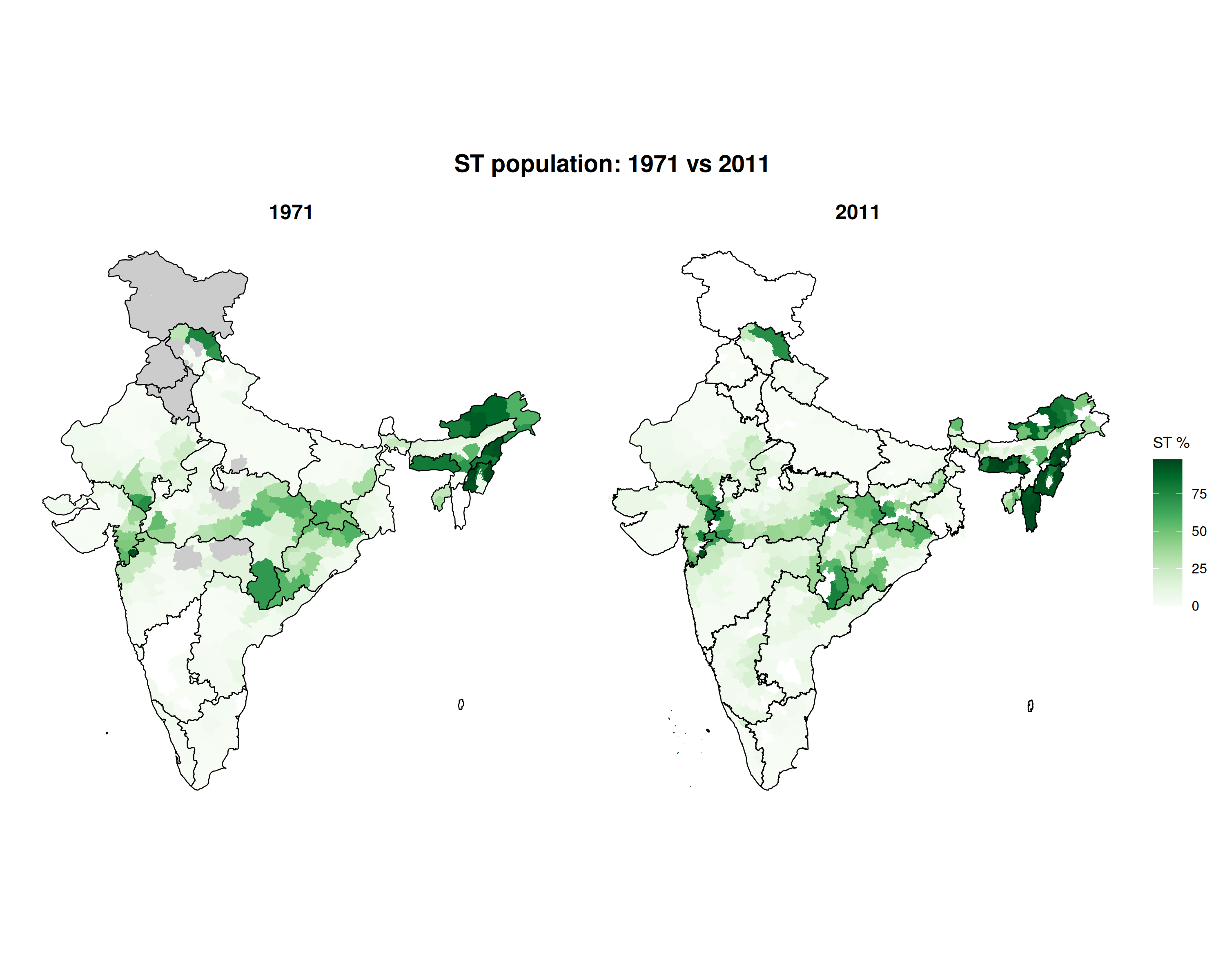
SC: 1971 vs 2011
compare_maps(
  list(
    "1971" = sc_st_1971,
    "2011" = sc_st_2011
  ),
  fill_var = "sc_pct",
  title = "SC population: 1971 vs 2011",
  legend_title = "SC %",
  palette = "oranges"
)
Scheduled Tribe population
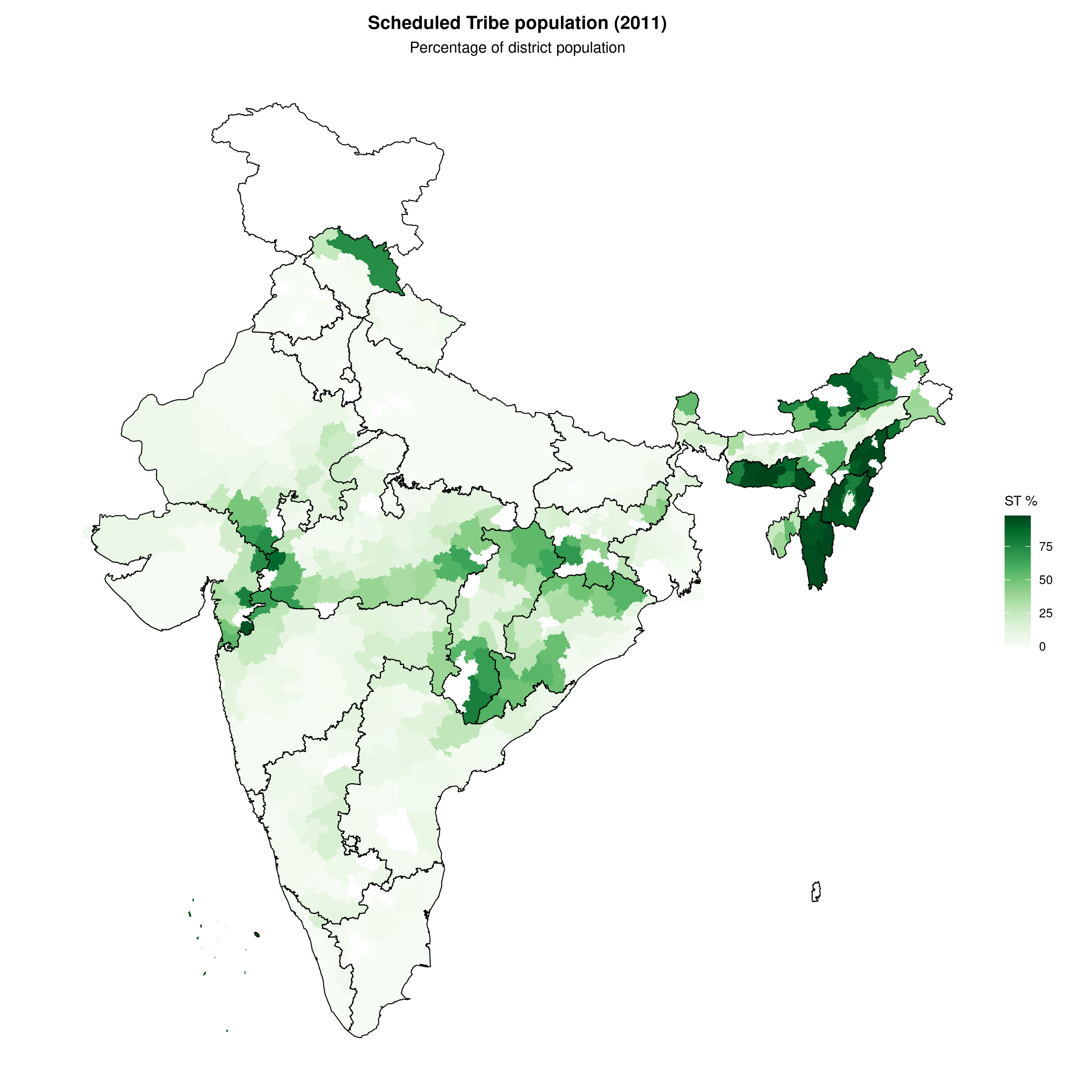
ST: 2011
plot_map(
  sc_st_2011,
  fill_var = "st_pct",
  title = "Scheduled Tribe population (2011)",
  subtitle = "Percentage of district population",
  legend_title = "ST %",
  palette = "greens",
  show_state_boundaries = TRUE
)
ST: 1971 vs 2011
compare_maps(
  list(
    "1971" = sc_st_1971,
    "2011" = sc_st_2011
  ),
  fill_var = "st_pct",
  title = "ST population: 1971 vs 2011",
  legend_title = "ST %",
  palette = "greens"
)
State-level summary (2011)
state_summary <- census_2011_pca |>
  group_by(state_name_harmonized) |>
  summarise(
    population = sum(population_total),
    sc_population = sum(sc_population),
    st_population = sum(st_population)
  ) |>
  mutate(
    sc_pct = round(100 * sc_population / population, 1),
    st_pct = round(100 * st_population / population, 1)
  ) |>
  arrange(desc(sc_pct + st_pct))

cat("States with highest SC population %:\n")
#> States with highest SC population %:
state_summary |>
  arrange(desc(sc_pct)) |>
  select(state_name_harmonized, sc_pct) |>
  head(5)
#> # A tibble: 5 × 2
#>   state_name_harmonized sc_pct
#>   <chr>                  <dbl>
#> 1 Punjab                  28.9
#> 2 Himachal Pradesh        24.7
#> 3 West Bengal             23
#> 4 Uttar Pradesh           21.1
#> 5 Haryana                 19.3

cat("\nStates with highest ST population %:\n")
#>
#> States with highest ST population %:
state_summary |>
  arrange(desc(st_pct)) |>
  select(state_name_harmonized, st_pct) |>
  head(5)
#> # A tibble: 5 × 2
#>   state_name_harmonized st_pct
#>   <chr>                  <dbl>
#> 1 Lakshadweep             94.5
#> 2 Mizoram                 94.5
#> 3 Nagaland                89.1
#> 4 Meghalaya               85.9
#> 5 Arunachal Pradesh       64.2
Bivariate choropleth: SC and ST together
This map uses a bivariate color scheme to show both SC and ST percentages simultaneously. The legend shows how colors combine: one axis represents SC concentration, the other ST concentration.
boundaries <- get_census_boundaries(2011, "district")

bivariate_data <- sc_st_2011 |>
  mutate(
    sc_pct = ifelse(is.na(sc_pct), 0, sc_pct),
    st_pct = ifelse(is.na(st_pct), 0, st_pct)
  ) |>
  bi_class(x = sc_pct, y = st_pct, style = "quantile", dim = 3)

map <- ggplot() +
  geom_sf(data = boundaries, fill = "grey85", color = "grey70", linewidth = 0.05) +
  geom_sf(data = bivariate_data, aes(fill = bi_class), color = "grey50", linewidth = 0.1, show.legend = FALSE) +
  bi_scale_fill(pal = "BlueOr", dim = 3, na.value = "grey85") +
  labs(
    title = "SC and ST population distribution (2011)",
    subtitle = "Bivariate choropleth showing joint distribution"
  ) +
  bi_theme()

legend <- bi_legend(pal = "BlueOr", dim = 3, xlab = "SC % ", ylab = "ST % ", size = 8)

map + inset_element(legend, left = 0.7, bottom = 0.05, right = 0.95, top = 0.3)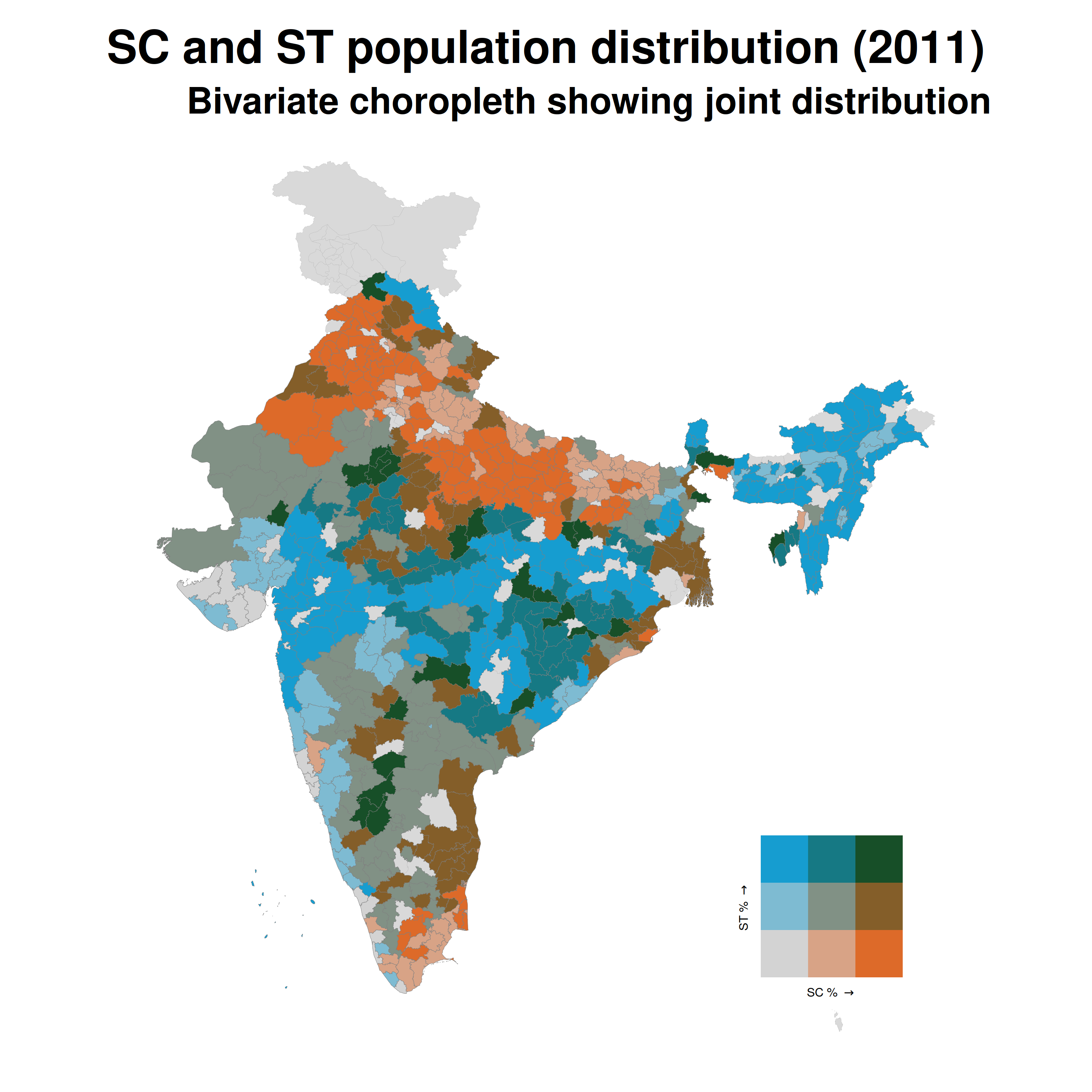
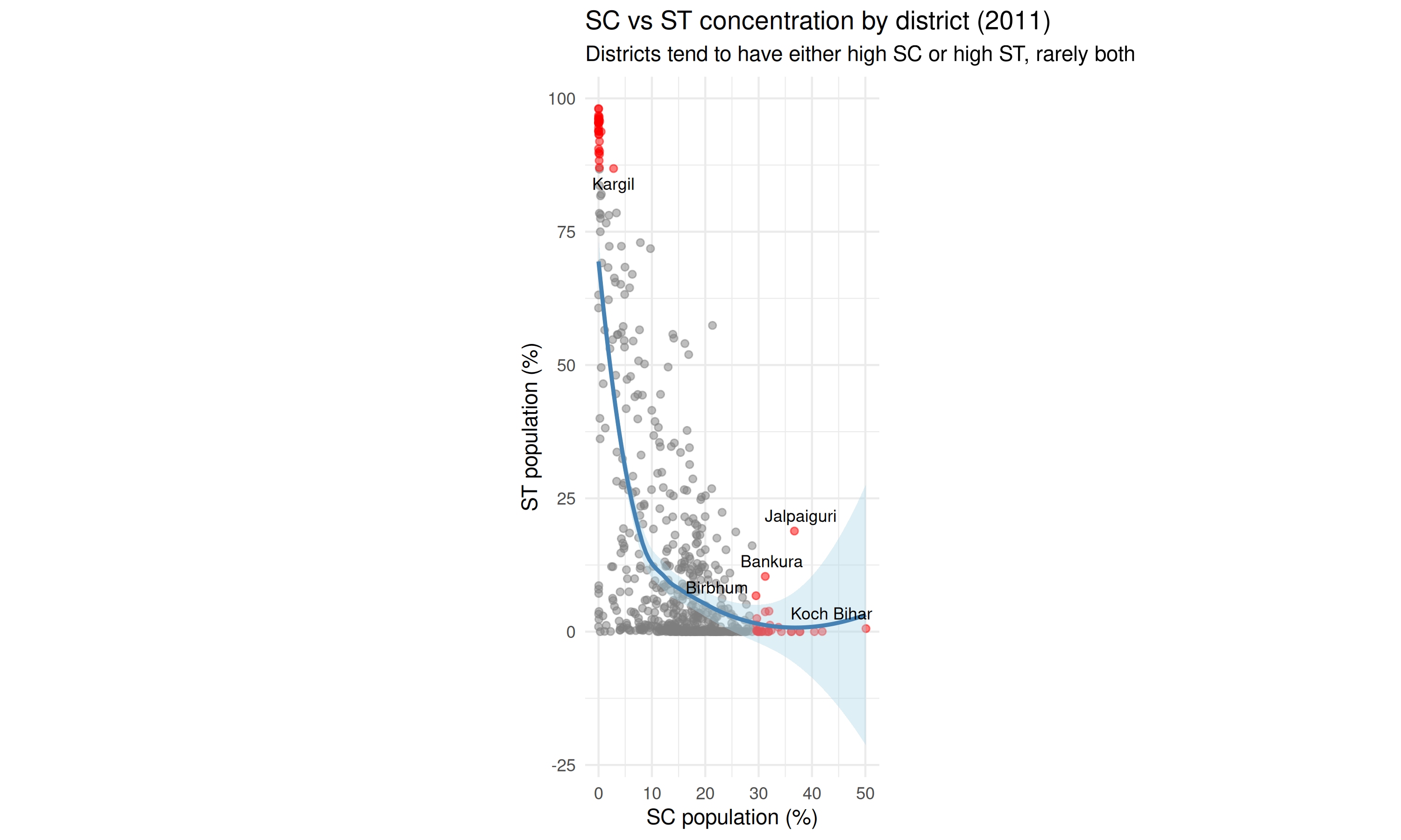
SC vs ST scatter plot
scatter_data <- sf::st_drop_geometry(sc_st_2011) |>
  mutate(
    is_extreme = sc_pct > quantile(sc_pct, 0.95, na.rm = TRUE) |
      st_pct > quantile(st_pct, 0.95, na.rm = TRUE),
    label = ifelse(is_extreme, name, NA)
  )

ggplot(scatter_data, aes(sc_pct, st_pct)) +
  geom_point(aes(color = is_extreme), alpha = 0.5) +
  geom_smooth(method = "loess", se = TRUE, color = "steelblue", fill = "lightblue") +
  geom_text_repel(
    aes(label = label),
    size = 3,
    max.overlaps = 15,
    na.rm = TRUE
  ) +
  scale_color_manual(values = c("grey50", "red"), guide = "none") +
  coord_fixed(ratio = 1) +
  labs(
    x = "SC population (%)",
    y = "ST population (%)",
    title = "SC vs ST concentration by district (2011)",
    subtitle = "Districts tend to have either high SC or high ST, rarely both"
  ) +
  theme_minimal()